In the following four screenshots I want to demonstrate how an e-commerce UI can be redesigned for greater usability. Changes like these increase profit margins, conversion rates and lower cost per acquisition, without increasing the ad spend.
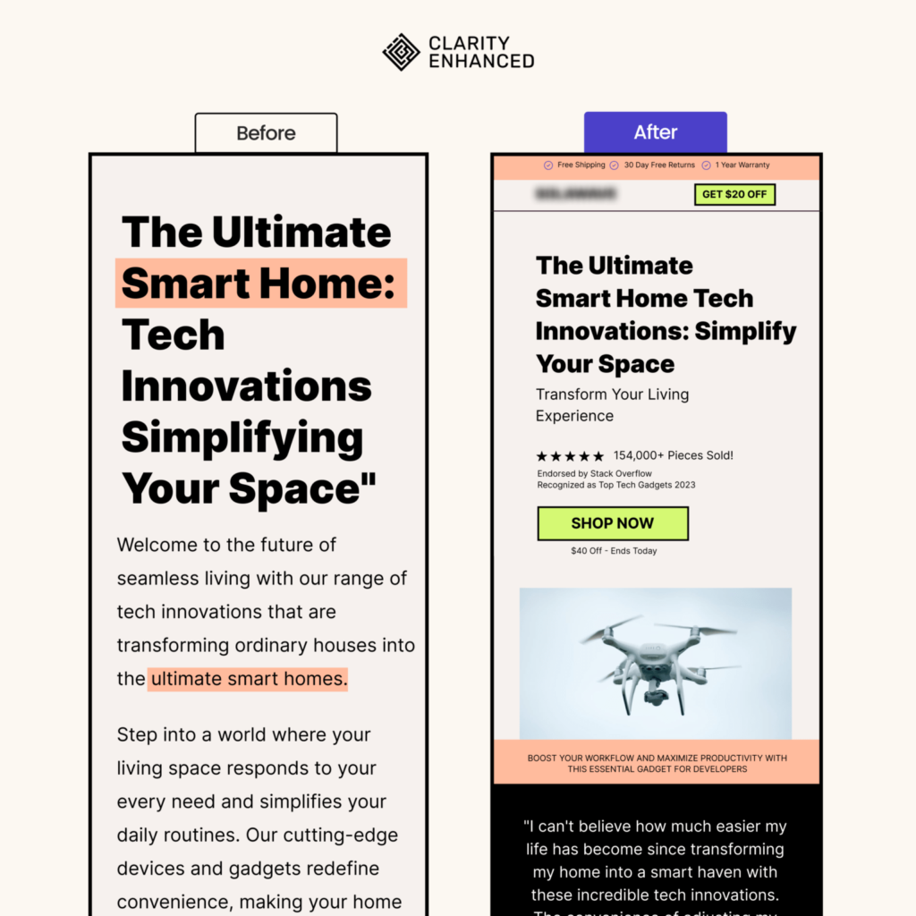
- Added a top header with some sale information.
- Added a logo and a call to action below it - a common mental model; pages that lack it seem suspicious.
- Made the main heading much smaller but still readable on mobile devices.
- Added a short and concise subheading, with reviews and a call to action that feature a discount.
- Added a related image with a customer testimonial.
- The new page is much easier to scan, features sale elements, and has a clear call to action that makes it easier for the user to navigate and decide.
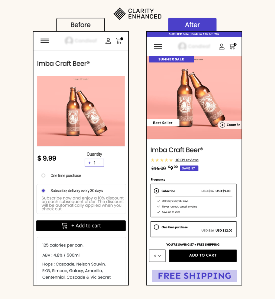
- Added a top banner - it adds contrast, attracts attention, and features the sale end date.
- Moved the product image just below the navbar. The product title is now below the image.
- Added an element on the image that attracts the eye featuring the sale, along with a few supporting details.
- The title is the biggest typographic element - it attracts the eye and explains what the product is all about.
- Added the stars and reviews widget that scrolls the page to the reviews section.
- Discount pill.
- Strong contrast for the subscribe / one-time purchase component.
- Quantity selector next to the CTA.
- Prominent free shipping component.
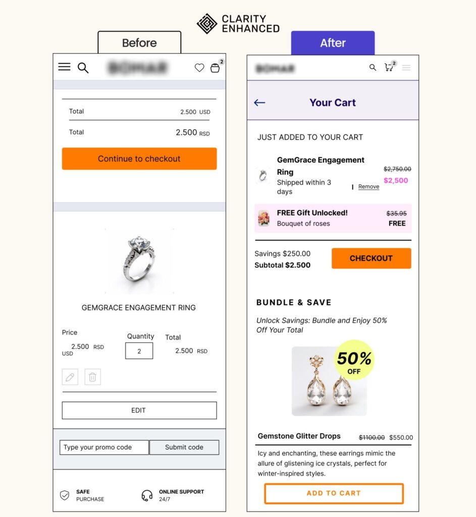
- Clearly state that the current page is "Your Cart".
- Clearly show items in the cart and highlight savings.
- Reduce the product image size - save on screen real estate.
- Remove the quantity picker for jewelry products.
- Remove the option to edit the cart; allowing users to remove an item is enough.
- Move the promo code form into checkout.
- Incentivize the purchase with a free gift.
- Strong, prominent checkout button.
- Offer a bundle discount on the cart page to increase AOV.
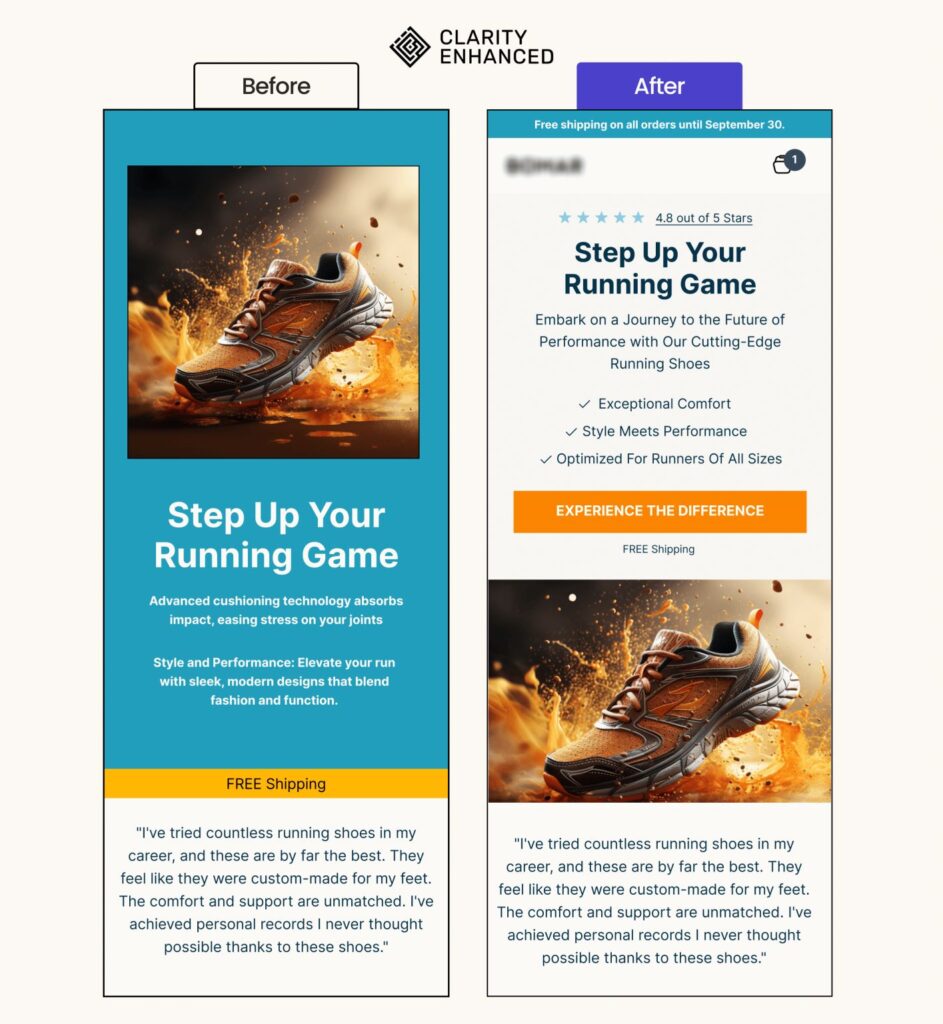
- Added a top header that features free shipping.
- Added a logo and cart icons that improve customer brand trust.
- Added a reviews link that scrolls the page to customer reviews when clicked.
- Increased contrast by making the hero section background white and moving the product photo down.
- Added bullet points that simply explain the product features and benefits.
- Added a clean, prominent call to action button with free shipping callout.